Mobile Billing UX.UI Design
From Paper to Pocket.
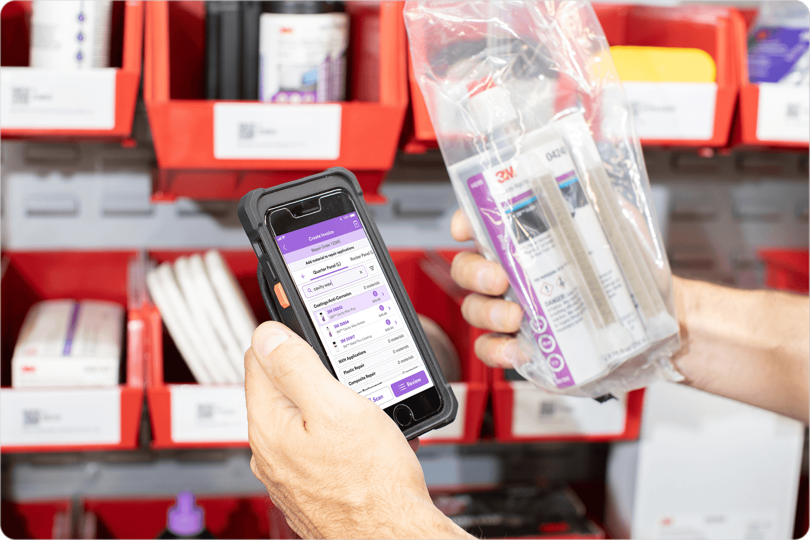
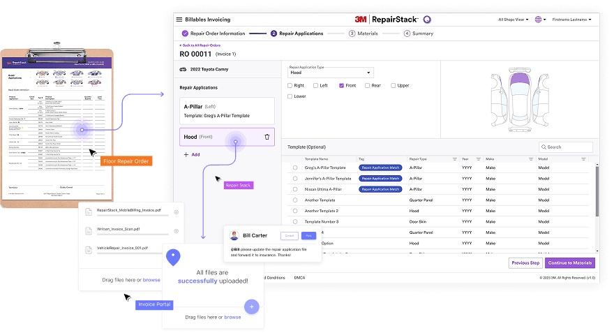
Invoicing That Works Where the Work Happens
This case study is protected.
The password lives in my resume, or contact me for a quick unlock.
Overview
The project improved 3M RepairStack Billables Invoicing by introducing an Easy Mobile Billing feature that lets estimators create and manage invoices directly on the shop floor.
As a UX design intern, I proposed and designed a mobile invoicing experience that supports real-time material documentation, and intuitive repair application entry. The goal was to replace analog workflows with a pocket-ready digital tool that fits naturally into daily shop operations.
The concept was validated with a 90 percent task success rate and was later adopted into the live mobile product.
My Role
UX Design Intern I 3M, SIBG Design Team
User Research, Wire Framing, Prototyping, UX/UI Audit, Usability Testing, Design System Development, Stakeholder Presentation
Team
Worked with the 3M RepairStack product group, including 2 UX researcher, 1 product manager, 2 developers, and 1 product owner.
Tool
Figma, Miro, Azure DevOps, Storybook, Microsoft Office
Duration
3 months, Jun-Aug 2025
Background
How might we replace analog workflows from paper to pocket with a mobile invoicing tool that supports real-time material documentation on the shop floor?
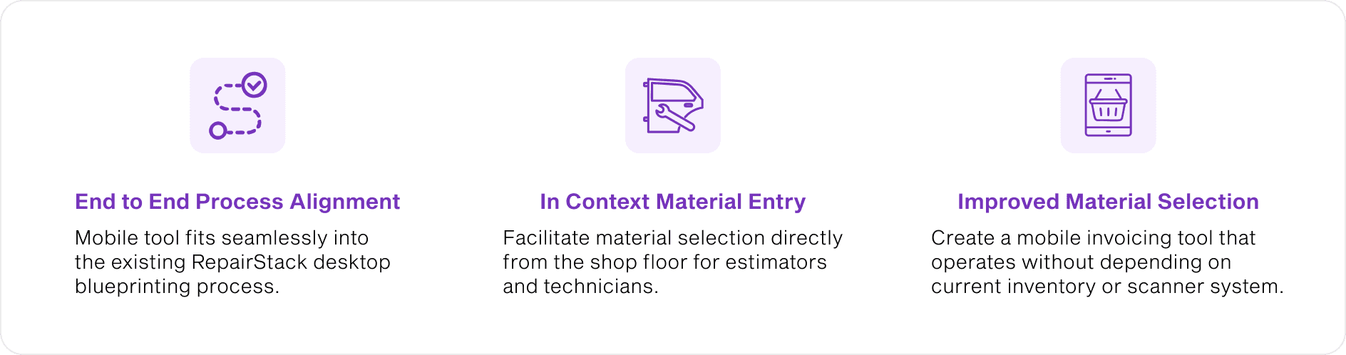
Our Solution
A mobile invoicing feature replaces manual workflows, letting estimators document repairs and submit invoices directly from the shop floor.
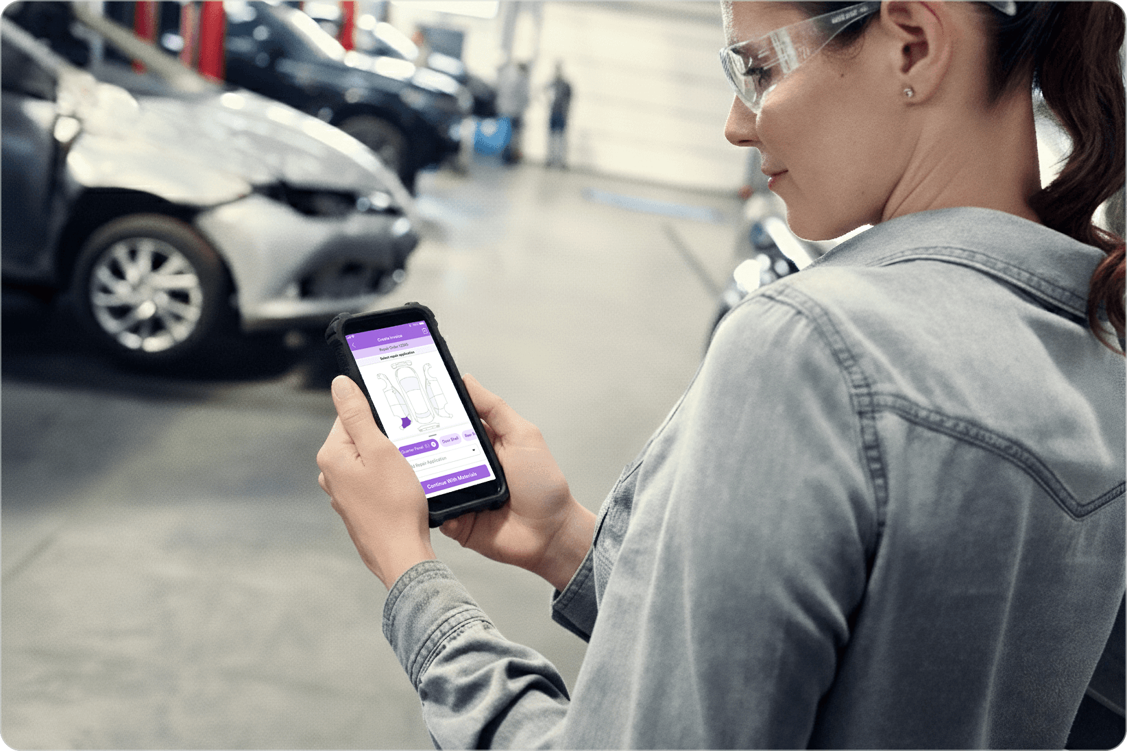
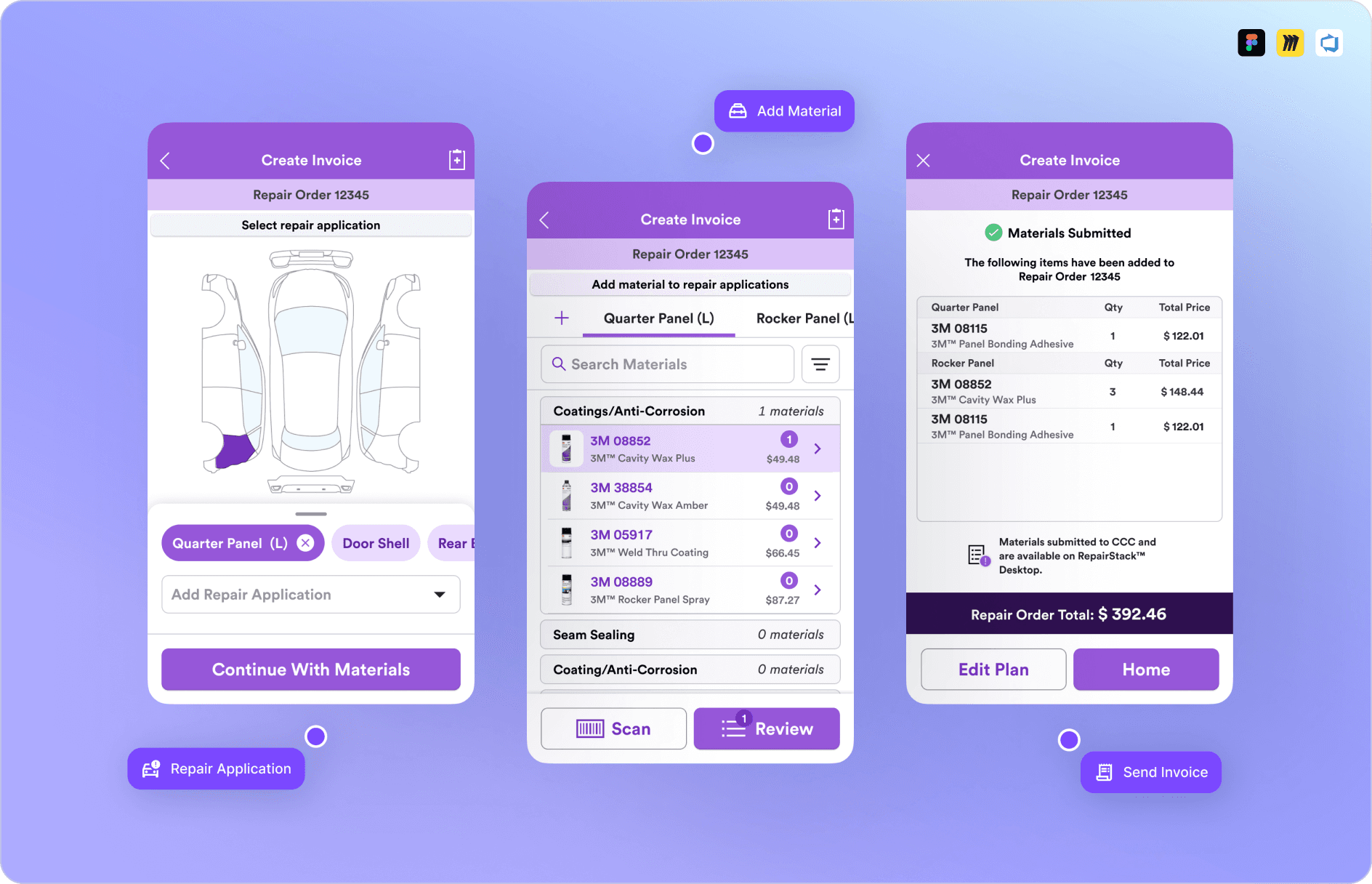
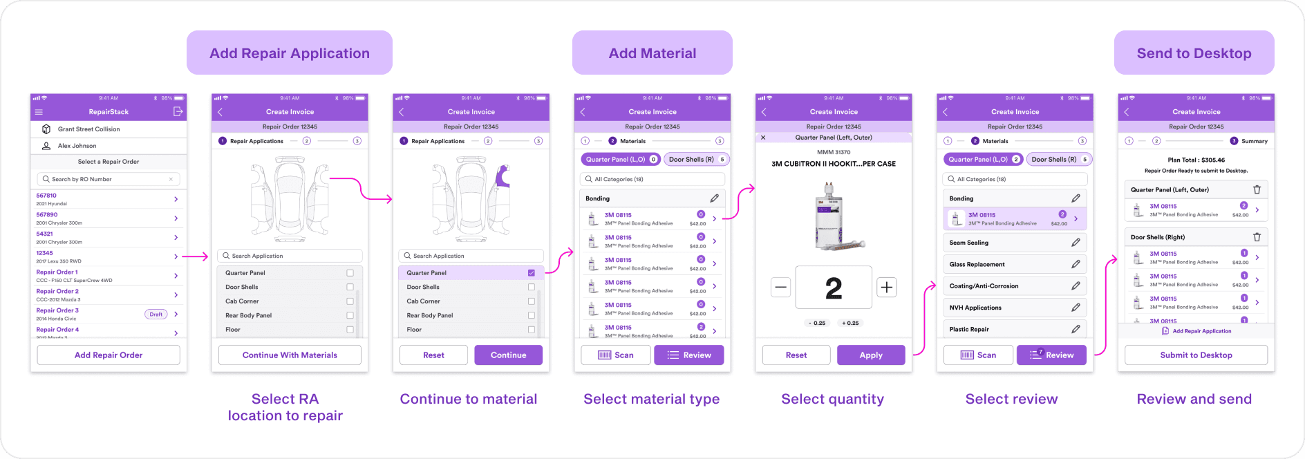
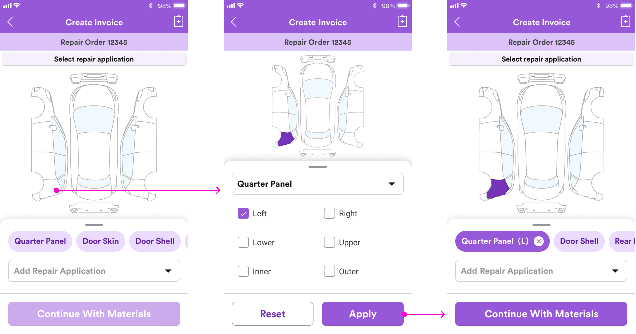
Capture Damage in Context
Mark vehicle damage directly on a visual diagram, making it easy to capture application details on the shop floor.
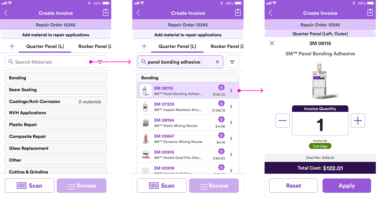
Add Materials on the Spot
Search or browse materials by category to quickly add items without leaving the shop floor.
Review and Submit
Allow users to review added repair applications and submit easily with a clear summary of materials, total repair applications, and cost.
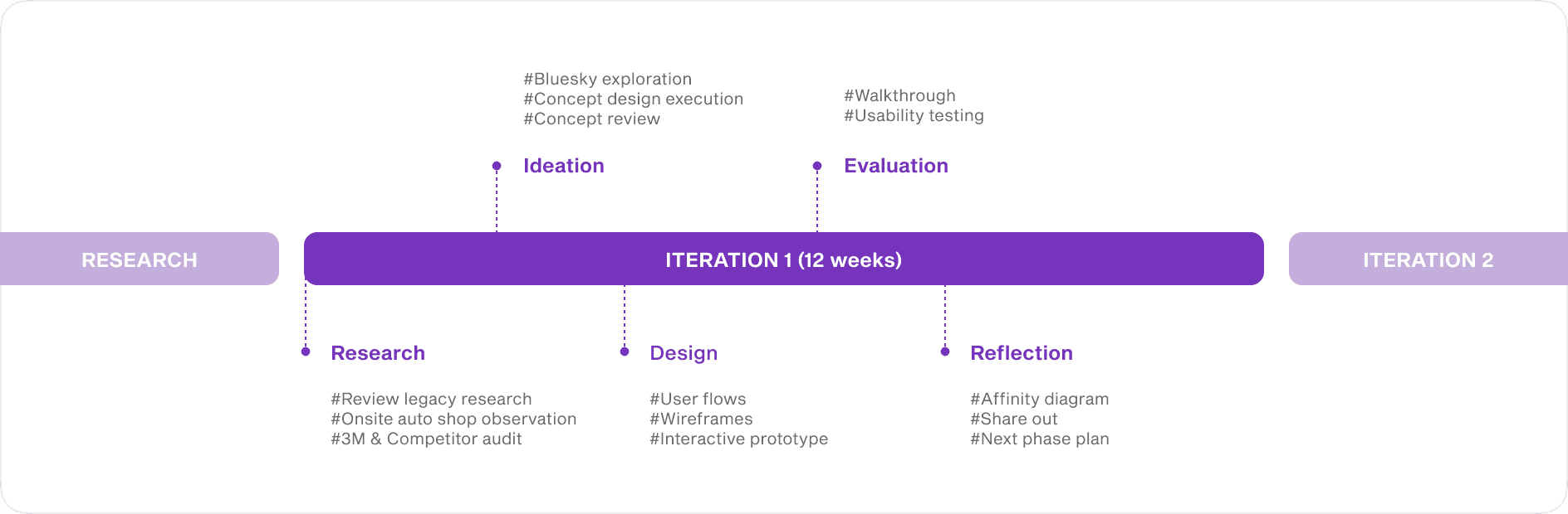
WORK PROCESS
Planning project timline
From research insight to proof of concept
As the sole UX designer, I initiated and scoped the mobile invoicing concept based on research insights. I aligned with cross-functional stakeholders, defined the experience direction, and prepared assets for the next phase of product development.
RESEARCH
Understanding estimator needs
Gaps in auto shop workflows with the current mobile application
By observing auto shop workflows, I identified friction both the 3M mobile and desktop invoicing flow. Estimators frequently switched between tools and relied on memory or paper notes. This revealed an opportunity to design an end-to-end mobile workflow that supports real-time documentation directly on the shop floor.
(Journey Map)
(Design Requirements)
DESIGN NEEDS
Defining the design space
Shaping the mobile invoicing opportunity
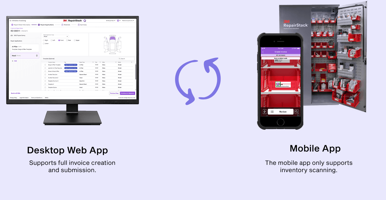
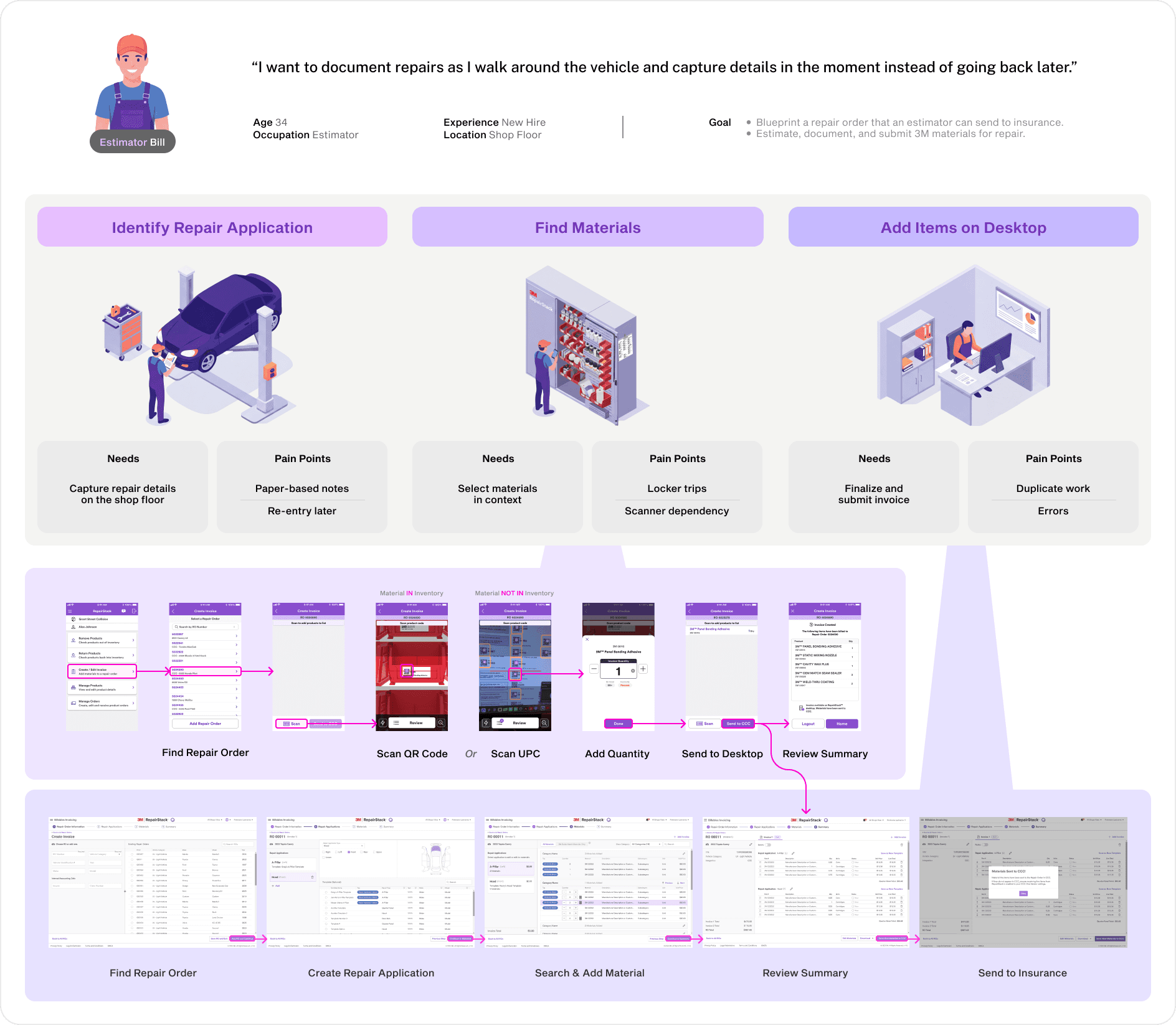
I mapped the invoicing journey across desktop and mobile to find where mobile could add the most value. I focused on helping estimators capture repair applications, and search materials easily, then aligned these features with the existing mobile flow for consistency.

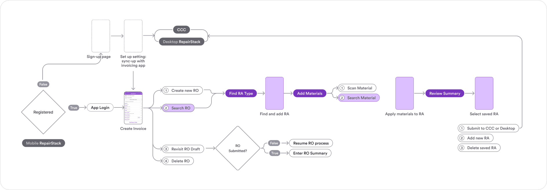
(User Flow)
DESIGN DEVELOPMENT
Building the mobile design direction
Developing a feasible mobile design concept
I explored multiple concept directions that supports and aligned with stakeholders to ensure feasibility and business alignment. The final direction focused on an interactive vehicle diagram for fast repair selection and a simplified material entry flow.
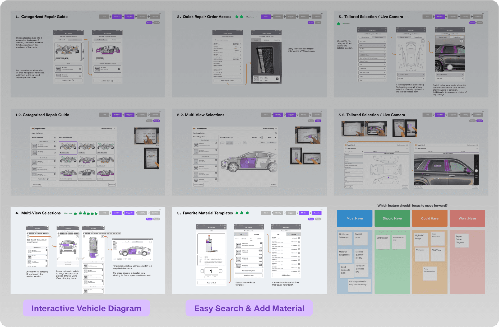
(Concept Sketch)
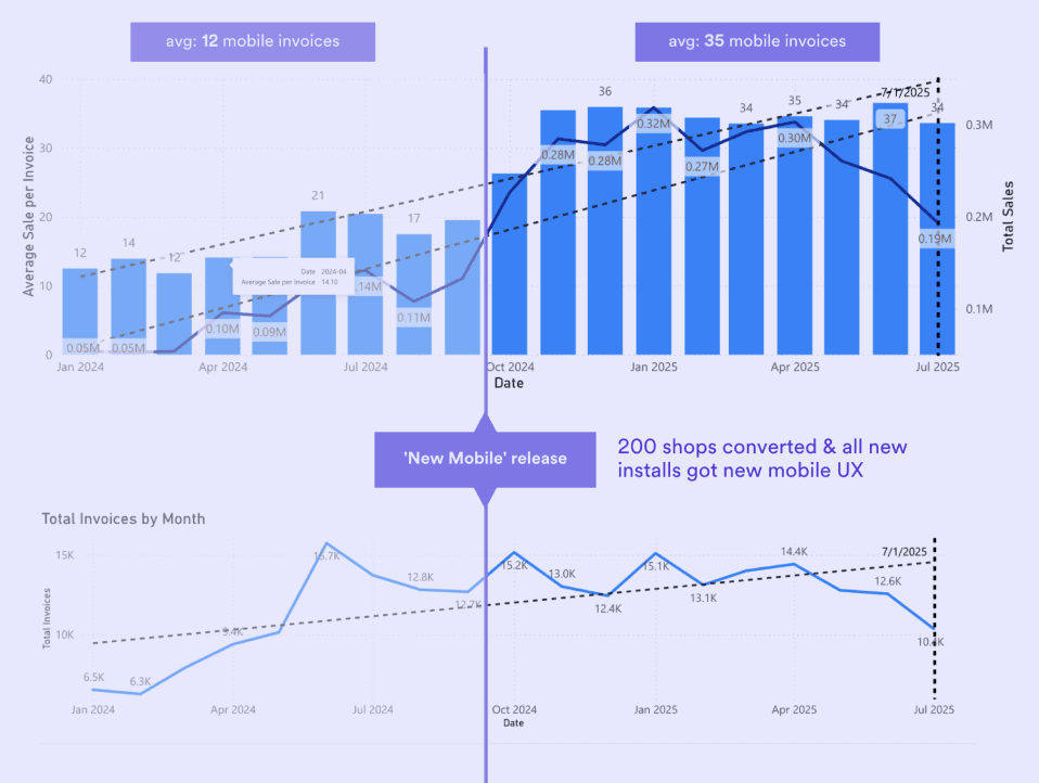
Prioritizing information for mobile simplicity
A key challenge was adapting dense desktop information into a mobile interface that supports quick, accurate decisions. I analyzed user performance data with the sales team to define clear information priorities. These insights shaped the core hypotheses and informed the mobile information hierarchy.
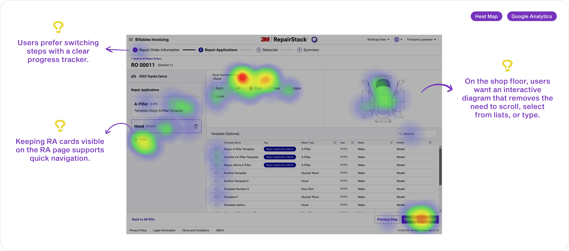
(Heat Map & Google Analysis)
Based on hypotheses about the primary interaction, I aligned with the product team on key information priorities and translated them into the mobile layout.
(Information Hierarchy)
From architecture to prototype
I defined the information architecture, designed key interactions, and built low-fidelity prototypes. After approval, I refined the design within the existing 3M design system for consistency.
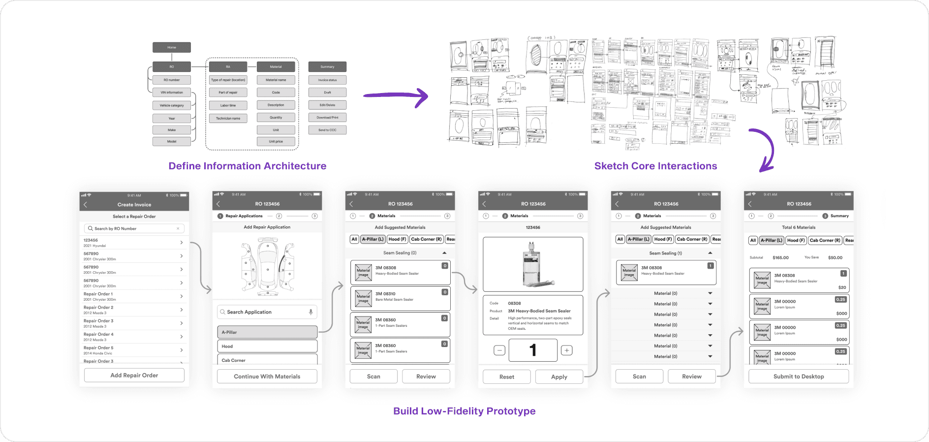
(Low Fidelity Prototype)
(High Fidelity Prototype)
DESIGN REFINEMENT
Improving clarity, consistency, and usability
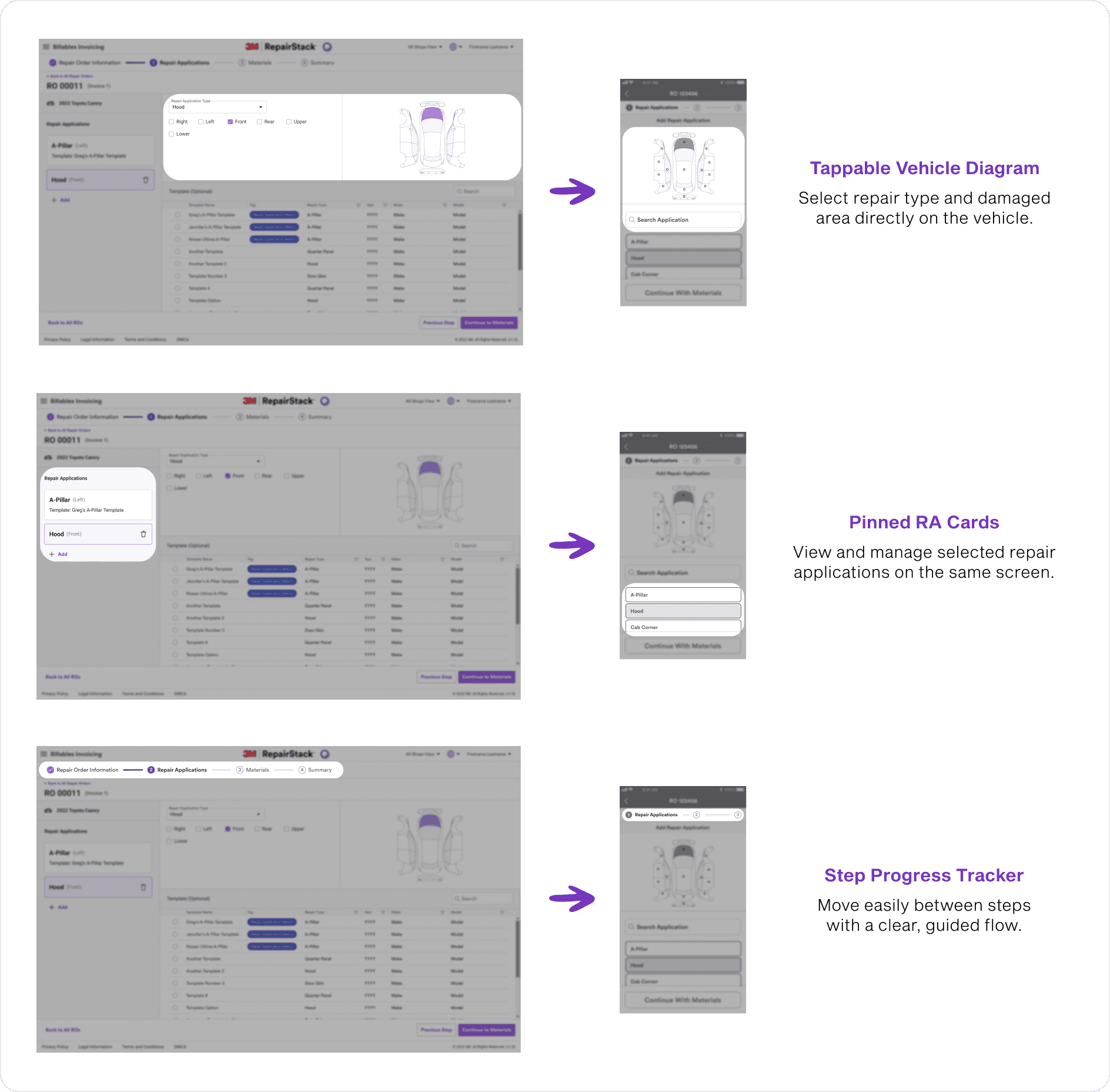
Refining the repair application selection flow
Through internal design critiques, I improved the repair application selection flow to reduce friction. I addressed issues with small touchpoints, limited location precision, and difficulty viewing or editing selected RAs.
The updated design keeps the vehicle diagram visible and responsive, while surfacing selected and frequently used repair applications so the most likely choices are always one tap away.

Improving touch accuracy and clarity
Prototype testing showed where real shop conditions break delicate interfaces:
Gloved hands miss small buttons, so I enlarged touch targets.
Estimators picture the car spatially, so I regrouped the layout to follow the vehicle's left-to-right order.
Busy shops leave no time to study a screen, so I clarified selection states to read at a glance.


Matching desktop tab behavior
To reduce ambiguity, I replaced the unclear RA cards with the tab pattern users already knew from desktop. Estimators could navigate the mobile version without relearning anything, since it behaved like the tool they used every day.

Reducing progress tracker interaction risk
Because the flow is short and linear, I moved the progress tracker into a navigation drawer. This freed primary screen space and reduced accidental taps, showing progress only when users seek it.


FINAL DESIGN
Design solutions and why they matter


PROBLEM
SOLUTION
EASE OF USE
ACCURACY
Provides simple, quick yet accurate
selections for application type.

PROBLEM
SOLUTION
EASE OF USE
ACCURACY / FAMILIARITY
EVALUATION
Validating the concept with users
Measuring impact through usability testing
In the final three weeks, I led usability testing with six estimators, designing task-based scenarios and measuring success rates to validate the concept. The prototype achieved a 90 percent success rate with no critical failures, confirming strong usability, and post-task feedback helped validate the value of the concept.


Evolving the concept through insight
Users preferred starting with the vehicle diagram but struggled with small touch targets. I recommended enhancing diagram-based navigation with clearer visual detail to improve accuracy and precision.

Testing also revealed that recognition cues shift with expertise. Material images were unnecessary for experienced estimators, but color distinction mattered. I proposed a color indicator during quantity selection, so the right variant stands out at a glance.
The proposed revisions influenced the final product experience and were later adopted into the live mobile application. 🎉

(Implications from Evaluation)
PRODUCT IMPACT
What I shared
Future planning and handoff
Before concluding my internship, I documented next-phase research plans, outlined the need for larger-scale feature validation, and expanded the mobile design system with responsive components. I aligned design components with engineering and visual design teams to support future integration.

REFLECTION
My take away from the journey

👊 Project challenge
The biggest challenge was navigating a complex product ecosystem while collaborating with diverse stakeholders (engineering, product, sales, design, leadership) and understanding a new business model. I addressed this by asking targeted questions, adapting to different team languages, and aligning design decisions with business and product goals. I proactively led efficient workshop meetings, structuring the right questions to get clear answers and make the best use of time.
📝 What I learned
Designing for the shop floor taught me that context beats convention. Gloved hands, bright light, and constant movement reshape every standard mobile pattern. This project strengthened my ability to design across systems, translate desktop workflows to mobile, and balance usability within industrial environments.
👉 If I had more time
I would expand testing with a broader set of estimators for quantitative insights, run targeted A/B tests for feature preferences, and deepen accessibility refinements to align with WCAG standards for future release.


